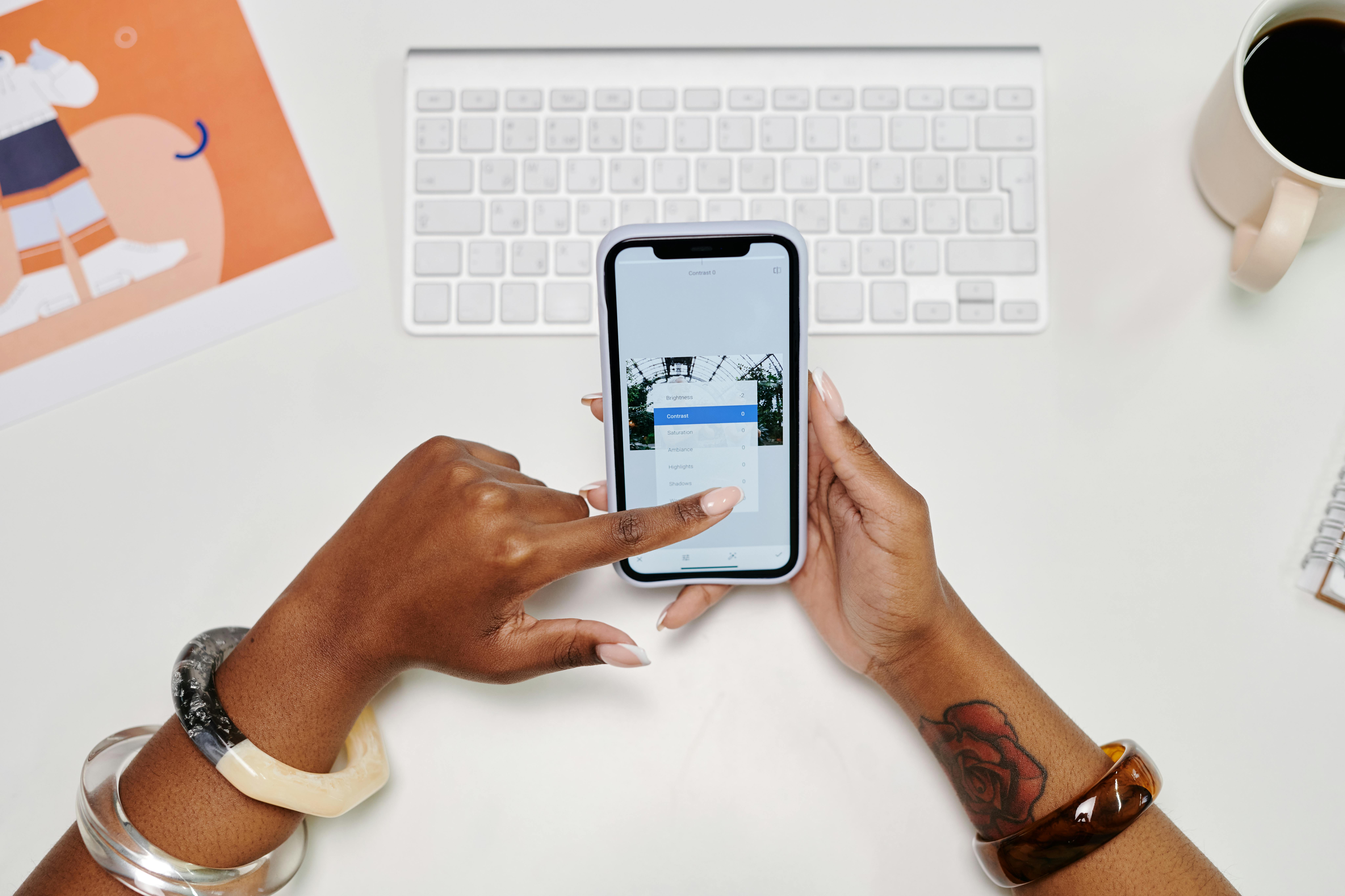
Did you know that most people now open websites on their phones? That first moment matters a lot. If your mobile website is messy, most people will bounce. And so you need to make your page feel at home on a small screen. No-code tools make that easier. Now you can build the look and flow even without writing a single line of code.
Now, let’s walk through how to make your site stand out on phones and tablets using visual design platforms.
Responsive design is more than resizing
Some people say a site is mobile-friendly if it “fits.” That’s a low bar, because a good responsive design adjusts the layout to match the screen size. It also keeps the text easy to read and the page loads quickly, even on slow data connections. And it makes menus and buttons easy to tap with fingers. A phone is not a tiny laptop, and so your site should not act like one.
How no-code platforms help
No-code builders give you a visual way to build responsive pages. You can adjust spacing and layout for each screen size. You can also check how it looks on phones, tablets, and computers right away. And this quick preview saves time. It also helps you catch problems even before they reach visitors.
But you need to be careful: even the best platforms require you to review and adjust each view. The auto-responsive features help, but your design sense still matters. The best no-code tools give you both automation and control.
Core “mobile optimization” features to look for

Not all no-code platforms are created equal when it comes to mobile design. And for this reason, look for tools that offer these key features:
- Custom breakpoint settings that let you create specific layouts for phone, tablet, and desktop
- Element anchoring that keeps things properly aligned when screens resize
- Show/hide options to display different content on different devices
- Content management that lets clients update text and images without breaking your careful layouts
These capabilities give you pixel-perfect control over how your site behaves across devices. It’s similar to what professional developers would code by hand.
Design across breakpoints without losing consistency
Start with your desktop design, but check the mobile view early and often. This will help you catch problems even before they’re baked into your design. Use relative sizing instead of fixed pixels to ensure elements scale properly. Also, make sure to keep your most important content front and center on small screens.
Most no-code tools let you toggle between device views with a single click. And so you can spot and fix layout issues right away.
Maintain a clear visual hierarchy across all screen sizes. That big, beautiful headline might need to shrink on phones, but it should still stand out as the main title.
Media + performance
Large images and videos can look amazing on a desktop, but can ruin your mobile experience. They consume data plans and make pages load at a snail’s pace. Use your no-code platform’s image optimization features to deliver properly sized photos to each device.
Sometimes you need to make tough choices, too. There may be occasions when you need to replace your background video with a static image—or, on mobile, hide decorative elements if they don’t add real value.
You can also test your site on a real cell phone network, not just your fast office Wi-Fi. You might be surprised by how slowly it loads in real-world conditions.
Mobile-Only Messaging with Conditional Visibility
Smart designers use conditional visibility to create custom experiences for each device. You can show shorter headlines on phones to prevent awkward wrapping. Another option is to display simplified call-to-action buttons that are easier to tap. You can also hide elements that create clutter on small screens.
But be careful! Don’t hide content that users need. The mobile version should still provide all the important information. The only difference is that you need to organize it better for small screens.
Test everything before you publish
Don’t trust the preview in your builder alone. Test on real phones and tablets (iOS and Android, if possible). Tap each button, complete the forms, and test the navigation. You can also look for text that is too small, spacing issues, or elements that extend beyond the screen.
Check how fast pages load, and fix anything that feels sluggish. Hand your phone to someone else and watch them use the site. If they get stuck anywhere, that is your cue to make further improvements.

